The Backstory about your JavaScript Metaphor
As I embarked upon the realm of crafting a Next.js project infused with TypeScript, I encountered a profound necessity—a central sidebar menu configuration that would bestow upon us a realm of consistency and scalability. Our noble objective was to fashion a malleable menu system, one that could gracefully accommodate updates and bespoke alterations across an array of pages and components. With TypeScript as our steadfast companion, we sought to harness its formidable power of static typing, thereby fortifying our code with unwavering reliability and unwaning maintainability. Armed with meticulous planning and ingenious design, we embarked upon a grand odyssey—a quest to forge a central sidebar menu configuration, an embodiment of harmonized navigation, and a guarantee of a sublime user experience throughout our illustrious endeavor.
The JavaScript Story!
As we are well aware, when treading the realms of TypeScript, it is incumbent upon us to fashion meticulous definitions. These exquisite artifacts bestow upon us the power to discern errors swiftly during the development process and promptly rectify them.
I am embarking on a project utilizing Next.js App Router and Shadcn-UI. This endeavor marks a new and momentous chapter in my career as a Software Freestyle Engineer.
The Abstract Definition
In the vein of crafting a research journal, I am compelled to fashion an abstract that shall subsequently unfold into a captivating phenomenon of eloquent prose, adorned with a hint of narcissistic flair.
// Filename: types/sidebar.ts
export interface SubmenuItems {
    label: string;
    link: string;
}

export interface NavItems {
    label: string;
    icon: React.ReactElement | undefined;
    link: string;
    isParent: boolean;
    subMenu?: SubmenuItems[];
}

export interface SidebarProps extends React.HTMLAttributes<HTMLDivElement> {
    menus: NavItems[];
}
The following code presents a comprehensive definition of TypeScript interfaces and React component prop types for a sidebar component.
The
SubmenuItemsinterface delineates the composition of submenu items within the sidebar. It encompasses two properties:label, denoting the label for the submenu item, andlink, representing the associated URL link.The
NavItemsinterface outlines the structure of navigation items within the sidebar. It encompasses properties such aslabelfor the navigation item label,iconfor the corresponding React element depicting the item's icon,linkfor the associated URL link,isParentto indicate the presence of submenus, and an optionalsubMenuproperty of typeSubmenuItems[], which facilitates the definition of an array of submenu items.The
SidebarPropsinterface extends the HTML attributes of adivelement and introduces amenusproperty of typeNavItems[]. This property allows for the definition of an array of navigation items to be passed as props to the sidebar component.
In essence, this code provides a structured approach to defining types and props required for a sidebar component, promoting seamless utilization and type-checking within a React application.
A Central Sidebar Configuration
A well-designed sidebar menu like this one is a testament to the power of intuitive UI/UX, providing users with a clear and structured path to navigate through various sections of an application
// Filename: config/sideMenu.tsx
import { NavItems } from "@/types/sidebar";
import { Icons } from "@/components/icons";

export const sideMenu: NavItems[] = [
  {
    label: "Master Data",
    icon: undefined,
    link: "javascript:;",
    isParent: false,
  },
  {
    label: "Master Korcam",
    icon: <Icons.userSquare className="w-4 h-4" />,
    link: "/dashboard/master-korcam",
    isParent: false,
  },
  {
    label: "Master Kordes",
    icon: <Icons.userSquare className="w-4 h-4" />,
    link: "/dashboard/master-kordes",
    isParent: false,
  },
  {
    label: "Master Korlap",
    icon: <Icons.userSquare className="w-4 h-4" />,
    link: "/dashboard/master-korlap",
    isParent: false,
  },
  {
    label: "Master Pemilih",
    icon: <Icons.userSquare className="w-4 h-4" />,
    link: "/dashboard/master-pemilih",
    isParent: false,
  },
  {
    label: "Settings",
    icon: <Icons.settings className="w-4 h-4" />,
    link: "/settings",
    isParent: true,
    subMenu: [
      {
        label: "Profile",
        link: "/settings/profile",
      },
      {
        label: "Preferences",
        link: "/settings/preferences",
      },
    ],
  },
]
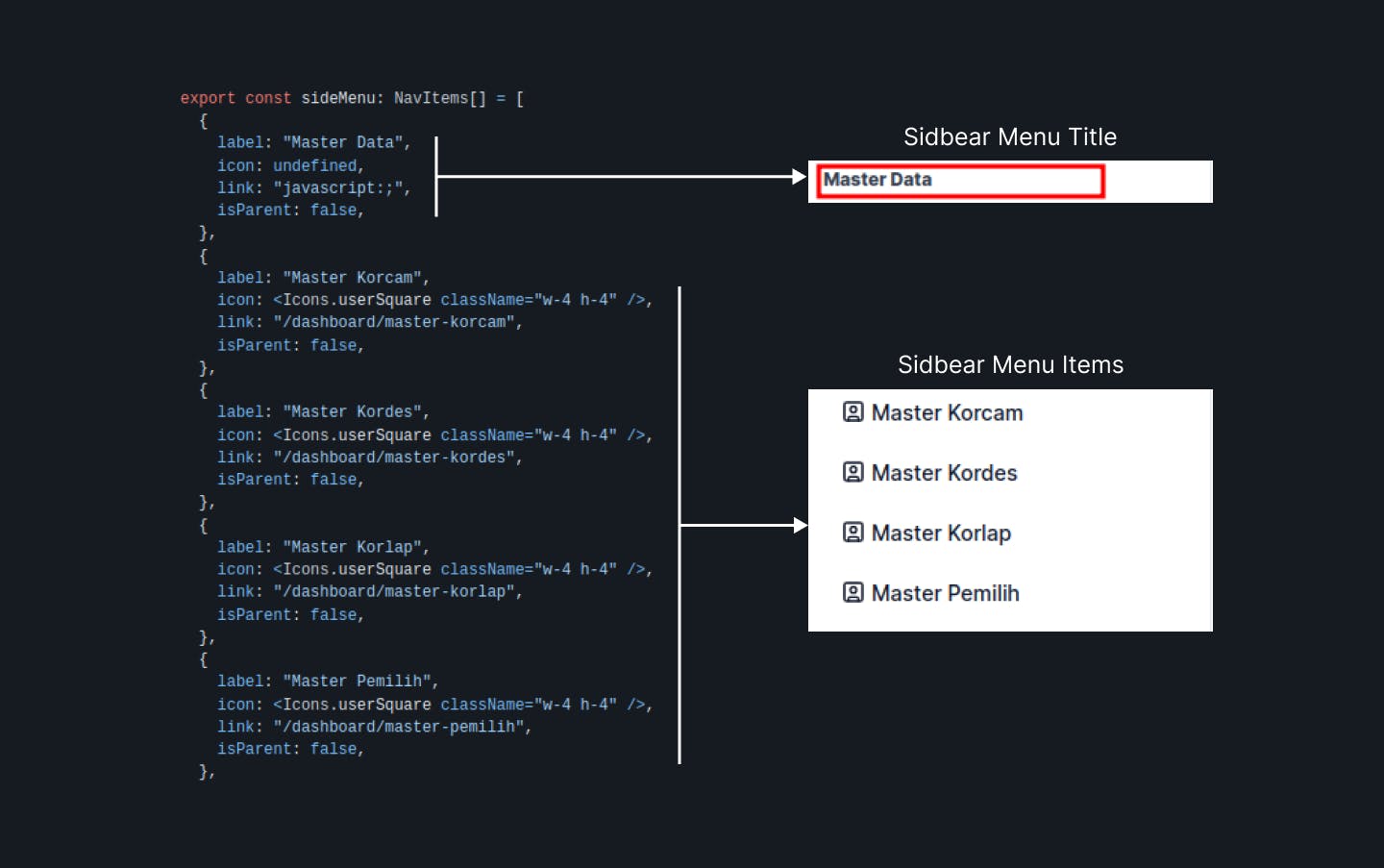
The provided code establishes an arrangement for the sidebar navigation menu within a dashboard or application through the definition of an array named sideMenu, having a type of NavItems[].
Each element within the sideMenu array represents a distinct menu item within the sidebar. These elements possess properties such as label for the menu item's label, icon for associating an icon with the menu item (utilizing the Icons component), link for the corresponding URL link, and isParent to signify whether the menu item contains submenus.
The code initializes the sideMenu array with various menu items. For instance, "Master Data" serves as a top-level item without an icon. Additionally, other items such as "Master Korcam," "Master Kordes," and so forth, are equipped with icons sourced from the Icons component, along with their respective links.
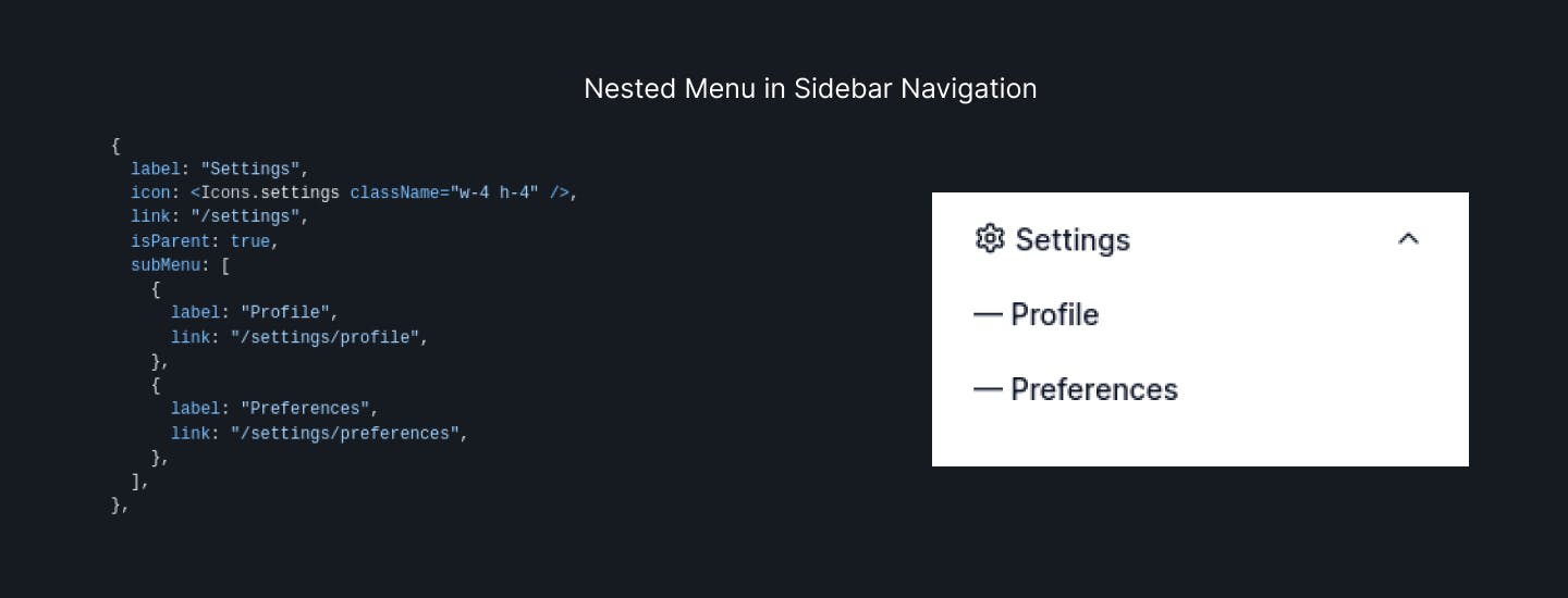
Furthermore, there exists a "Settings" menu item adorned with the "settings" icon, and isParent is set to true, indicating the presence of submenus. The submenus themselves are defined within the subMenu property as an array of objects comprising label and link properties.
All in all, this code establishes the configuration for a sidebar menu, encompassing an array of menu items complete with labels, icons, links, and submenus. This configuration can be employed to render the sidebar navigation within a React application.
The Sidebar Component
Once we have abstracted our imagination and begun unraveling it into a journey towards the dream we desire—an exquisite center of command for the sidebar menu in our application—it is now time to execute our intentions and bring forth the creation of the sidebar menu component.
// Filename: components/sidebar.tsx
"use client"
import Link from "next/link"
import { usePathname } from "next/navigation"
import {
Accordion,
AccordionContent,
AccordionItem,
AccordionTrigger,
} from "@/components/ui/accordion"
import { Button, buttonVariants } from "@/components/ui/button"
import { ScrollArea } from "@/components/ui/scroll-area"
import { cn } from "@/lib/utils"
import { SidebarProps } from "@/types/sidebar"
import { Icons } from "./icons"
export function Sidebar({ className, menus }: SidebarProps) {
const pathname = usePathname()
return (
<div className={cn("pb-12", className)}>
<div className="space-y-4 pb-2">
<div className="py-2">
<ScrollArea className="min-h-[300px] max-h-screen px-2">
<div className="space-y-1 p-2">
<Link
className={`${buttonVariants({
size: "sm",
variant: pathname === "/dashboard" ? "default" : "ghost",
align: "flexLeft",
})}`}
href={"/dashboard"}
>
<span className="inline-flex items-center justify-center gap-1">
<Icons.home className="w-4 h-4" /> Dashboard
</span>
</Link>
{menus?.map((menu, i) => {
if (menu.isParent === false && menu.link === "javascript:;" && menu.icon === undefined) {
return <strong key={`${menu}-${i}`} className="font-bold inline-flex items-start justify-start text-xs text-gray-700 dark:text-gray-400">{menu.label}</strong>
} else if (menu.isParent && menu.link !== "javascript::" && menu.icon !== undefined) {
return (
<Accordion
key={`${menu}-${i}`}
type="single"
collapsible
className="w-full"
>
<AccordionItem value={`item-${i}`} className="border-b-0">
<AccordionTrigger
className={buttonVariants({
size: "sm",
variant:
pathname === menu.link ? "default" : "ghost",
align: "flexBetween",
className: "hover:no-underline",
})}
>
<span className="inline-flex items-center justify-center gap-1">
{menu.icon} {menu.label}
</span>
</AccordionTrigger>
<AccordionContent>
{menu.subMenu?.map((subItem, subIndex) => (
<Button
key={`${subIndex}-${i}`}
variant="ghost"
size="sm"
className="w-full justify-start font-normal"
>
— {subItem.label}
</Button>
))}
</AccordionContent>
</AccordionItem>
</Accordion>
)
} else {
return (
<Link
key={`${menu}-${i}`}
className={`${buttonVariants({
size: "sm",
variant: pathname === menu.link ? "default" : "ghost",
align: "flexLeft",
})}`}
href={menu.link}
>
<span className="inline-flex items-center justify-center gap-1">
{menu.icon} {menu.label}
</span>
</Link>
)
}
})}
</div>
</ScrollArea>
</div>
</div>
</div>
)
}
The sidebar menu component will dynamically process and categorize the menus defined in config/sideMenu.tsx. Isn't this truly impressive? We simply need to define the menus we wish to display on the sidebar within a single configuration file.
Here is an illustration showcasing the transformation from the realm of imagination to the realization of our previous endeavors.
[Imagine -> Plan -> Create -> Achieve]
- Imagination: Visualizing the concept of a dynamic sidebar menu configuration.
- Planning: Mapping out the structure and properties of the menu items.
- Creation: Implementing the code to define the menu items and their characteristics.
- Achievement: Witnessing the manifestation of our vision as the dynamic sidebar menu comes to life.
This journey exemplifies the power of imagination and execution in bringing ideas to fruition.
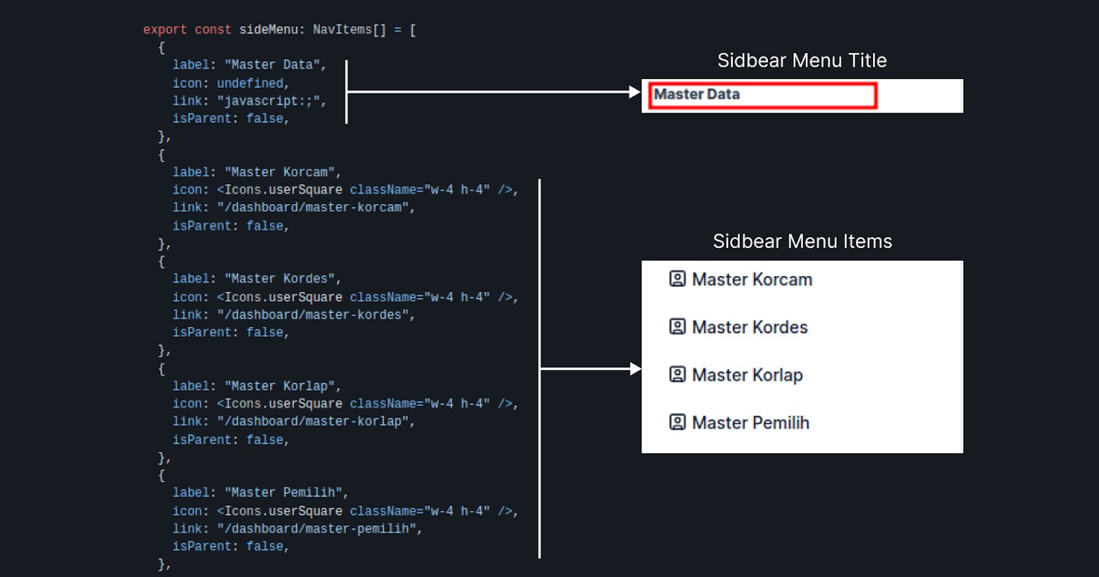
[The Graph - 001] - Sidebar Menu Title & Sidebar Menu Items

[The Graph - 002] - Nested Menu in Sidebar Navigation

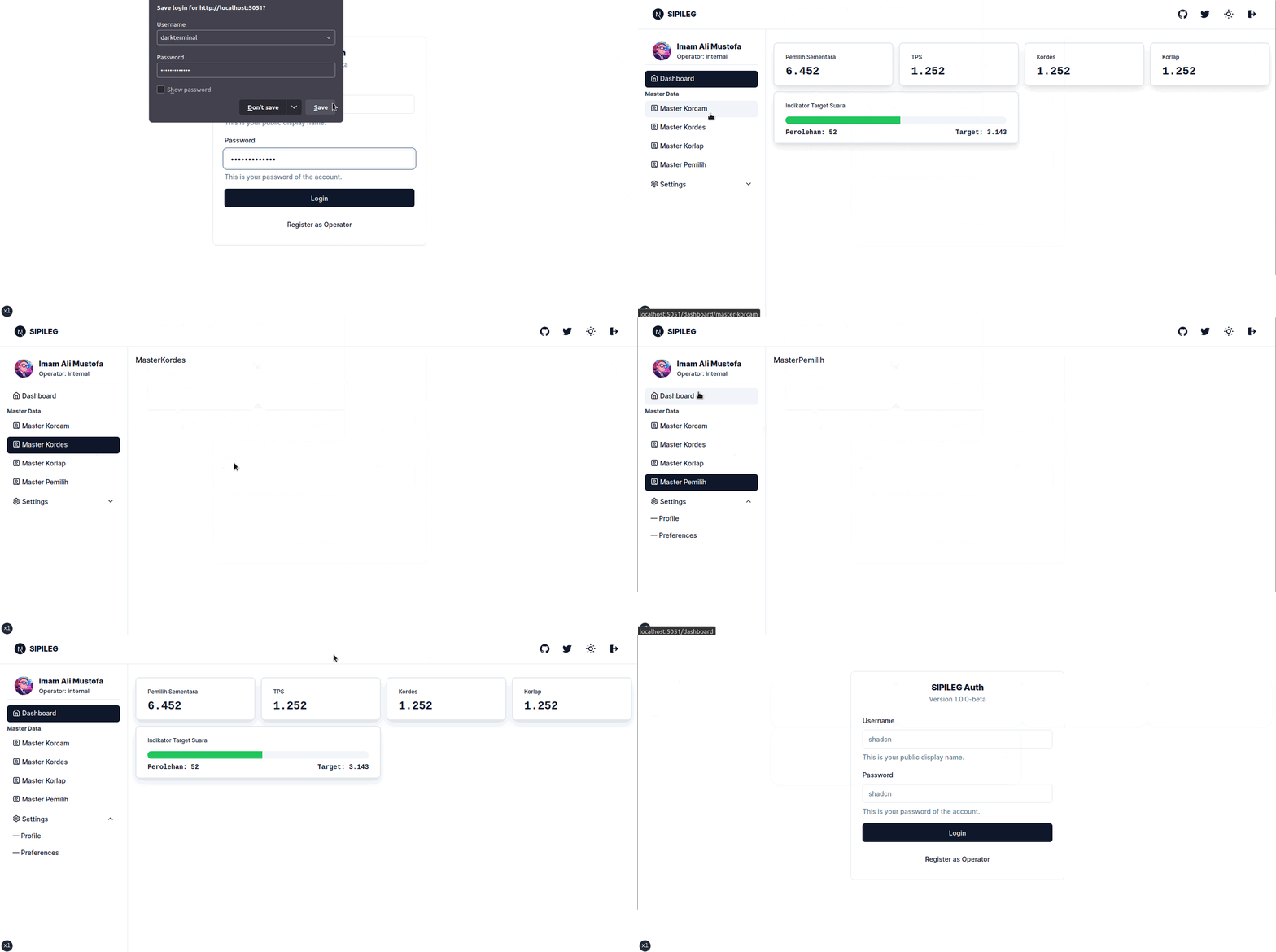
The Live Version of Our Imagination

The Last Freestyle Improvisation
As is my custom, I always strive to innovate upon existing foundations while staying true to my own character as a Software Freestyle Engineer.
The default button component provided by Shadcn-UI may not fully satisfy the imaginative requirements we envision. However, with a few modifications, we can transform it into something truly remarkable.
// Filename: components/ui/button.tsx
import * as React from "react"
import { VariantProps, cva } from "class-variance-authority"

import { cn } from "@/lib/utils"

const buttonVariants = cva(
  "rounded-md text-sm font-medium transition-colors focus-visible:outline-none focus-visible:ring-2 focus-visible:ring-ring focus-visible:ring-offset-2 disabled:opacity-50 disabled:pointer-events-none ring-offset-background",
  {
    variants: {
      variant: {
        default: "bg-primary text-primary-foreground hover:bg-primary/90",
        destructive:
          "bg-destructive text-destructive-foreground hover:bg-destructive/90",
        outline:
          "border border-input hover:bg-accent hover:text-accent-foreground",
        secondary:
          "bg-secondary text-secondary-foreground hover:bg-secondary/80",
        ghost: "hover:bg-accent hover:text-accent-foreground",
        link: "underline-offset-4 hover:underline text-primary",
      },
      size: {
        default: "h-10 py-2 px-4",
        sm: "h-9 py-1.5 px-3 rounded-md",
        lg: "h-11 px-8 rounded-md",
      },
      align: {
        flexLeft: 'flex items-start justify-start',
        flexCenter: 'flex items-center justify-center',
        flexRight: 'flex items-end justify-end',
        flexBetween: 'flex items-center justify-between',
        inlineLeft: 'inline-flex items-start justify-start',
        inlineCenter: 'inline-flex items-center justify-center',
        inlineRight: 'inline-flex items-end justify-end',
        inlineBetween: 'inline-flex items-center justify-between'
      },
    },
    defaultVariants: {
      variant: "default",
      size: "default",
      align: 'flexCenter'
    },
  }
)

export interface ButtonProps
  extends React.ButtonHTMLAttributes<HTMLButtonElement>,
    VariantProps<typeof buttonVariants> {}

const Button = React.forwardRef<HTMLButtonElement, ButtonProps>(
  ({ className, variant, size, ...props }, ref) => {
    return (
      <button
        className={cn(buttonVariants({ variant, size, className }))}
        ref={ref}
        {...props}
      />
    )
  }
)
Button.displayName = "Button"

export { Button, buttonVariants }
And I awoke from a profoundly beautiful dream, only to discover that the dream had indeed become a reality.
The Story Source: https://metaphore.vercel.app/stories/javascript/a-central-sidebar-menu-configuration
